What are the Key Takeaways from this Executive Summary?
Quick answer
- A blended number hides the problem. One on-time percentage for the whole network tells you nothing about which lane to fix.
- Benchmarks are scarcer than they look. Where a named body publishes a figure, it is cited below. For the rest, compare against your own last four quarters and against what your customer’s programme requires.
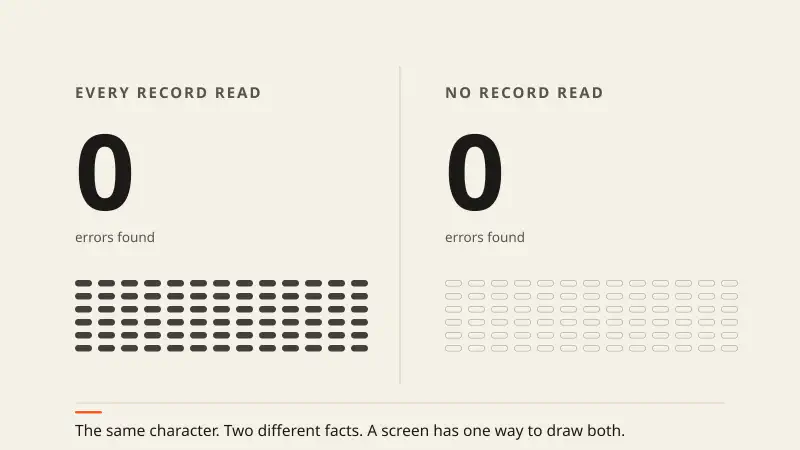
- A measure you cannot trace is a scoreboard. If you cannot get from the number to the records behind it, you cannot act on it.
Why Do Most Logistics Dashboards Fail Operations Leaders?
Quick answer
If your weekly review still runs on shipment volume and one blended on-time figure, you cannot act on it.
The questions a VP of Operations needs answered are narrower. Which lanes are dragging down on-time delivery. Which carriers are generating claims. Where dwell is adding warehouse cost nobody has attributed yet.
The ten measures below are the ones worth the effort. For each, the same three things: what it is, where your figure lives, and which way it should move.
1. OTIF (On-Time In-Full) — The Customer’s View of You
OTIF is the share of orders that arrive when agreed, complete, with no shortages or substitutions. It is the most customer-facing measure you have. Large retailers run supplier programmes with an OTIF threshold and charge back below it, so the number has a direct line to the P&L.
Where your figure lives: your transport system’s delivery records against the agreed dates in the order. Track it by SKU and lane, not as one average — the blend hides whether the cause is the carrier, the pick or the forecast. Which way it should move: up, and the spread between your best and worst lanes should narrow.
2. Order Cycle Time — Speed the Customer Feels
Order cycle time is the elapsed time from order receipt to delivery. It covers order handling, picking, packing, transit and the last mile.
Order cycle time is the measure most often linked to whether a customer stays, and the link is worth testing on your own book rather than taking on trust: rank last year’s accounts by their median cycle time and see how retention differs across the ranking. Where your figure lives: order timestamps in your planning system and delivery timestamps in your transport system. Break it into stages, because creep usually hides in dock dwell or order release rather than in transit. Which way it should move: down, and a stage at a time.
3. Perfect Order Rate — The Measure That Finds the Weak Link
Perfect Order Rate is the share of orders delivered on time, complete, undamaged, and with correct paperwork. Any one failure marks the whole order imperfect, which is why it sits below every individual measure.
There is no cross-industry average worth quoting here — the measure is defined differently by almost everyone who reports it, which makes a benchmark comparison meaningless before you have defined your own. Where your figure lives: you will have to join four sources — delivery records, pick accuracy, claims, and invoice corrections. That join is the work. Which way it should move: up, and the first pass usually shows one of the four components doing most of the damage.
4. Freight Cost per Unit Shipped — The Cost Guardrail
This divides total freight spend by units shipped: cases, pallets or eaches. It lets you compare across seasons, product lines and regions, which total spend does not.
Where your figure lives: freight invoices against shipped quantities. Which way it should move: down, or flat against rising volume. A rising trend while total spend looks steady points to lost rate discipline, wrong mode choice, or part-loads that should have been consolidated. Set your own target from your last four quarters; a published benchmark will not know your mix.
5. Warehouse Capacity Utilisation — Throughput Against Flexibility
Utilisation is the share of storage and throughput capacity in use. Too high and a demand surge has nowhere to go; too low and you are paying for space you do not use.
Where your figure lives: your warehouse system’s location occupancy and labour hours against capacity. Which way it should move: toward whatever range lets your own peak weeks run without overtime. Find that range by looking at the utilisation level on the weeks your facility last struggled.
6. Inventory Turnover Ratio — Cash in Another Costume
Turnover divides cost of goods sold by average inventory value. Higher turnover means less cash sitting in stock and lower carrying cost: space, insurance, and the risk of obsolescence.
APICS benchmarks show top-performing consumer goods companies reaching 8–12 turns a year, and industrial distributors targeting 4–6. Where your figure lives: finance holds both inputs. Which way it should move: up, though not past the point where fill rate suffers — which is why this one is read next to OTIF, not on its own.
7. Dock-to-Stock Time — The Bottleneck Nobody Owns
Dock-to-stock is the time between a trailer arriving and the stock being available to pick. It is often uncounted, and it quietly inflates safety stock.
Where your figure lives: the gap between the gate-in record and the put-away confirmation in your warehouse system. Which way it should move: down. Advance shipping notice-driven receiving, cross-docking and directed put-away are the usual levers. Measure your own current figure first: most teams are surprised, and the surprise is the argument.
8. Claims Ratio — The Cost of Damage, Properly Counted
Claims ratio is freight claims as a share of shipments, by count or by value.
Where your figure lives: your claims file, which is probably in finance rather than operations. Which way it should move: down. The useful version is split by carrier, lane and commodity — that turns a back-office total into a list of things to fix, such as packaging, load planning, or one terminal’s handling.
9. Carbon Emissions per Shipment — Now a Reporting Requirement
This is the CO₂-equivalent for each order delivered. The EU’s Corporate Sustainability Reporting Directive and Scope 3 disclosure rules have moved it out of the annual report and into operational planning.
Where your figure lives: mode, distance and weight per shipment, from your transport system, against a published emissions factor. Which way it should move: down, through mode shift, fuller loads and carrier selection. Your baseline is your own current mode mix; a cross-industry figure will not match it.
10. Carrier Scorecard Compliance — Managing the Partners Who Do the Work
This measures each carrier against the standards you set: on-time pickup, on-time delivery, claims, billing accuracy, and how quickly they respond to an exception.
Where your figure lives: you build it, from your own delivery and invoice records. Which way it should move: toward fewer carriers accounting for your service failures, and toward lane allocation that reflects the scorecard. Count first how much of last quarter’s failure volume came from how many carriers. That concentration is usually the finding.
What Should Automation Do Here?
Quick answer
The hard part is not picking measures. It is keeping them accurate across split systems: transport, warehouse, yard, planning, carrier EDI feeds, and telemetry from equipment.
Runink FACE reads across those sources and compares each record against the rule that governs it. An outlier then arrives as a named lane, carrier or facility rather than as a moved average. The measures, and what counts as acceptable on each, stay yours to set.
The distinction worth keeping is between a report that states a rate and a process that produces an exception someone has to close. A monthly deck is the first. It is comfortable, and nobody can act on it. Connect with the Runink team if you want to talk through which of your ten could be read record by record instead.
Conclusion
Quick answer
Audit your current dashboard against these ten. Then ask one question of each number on it: can I get from this to the records that produced it?
If you cannot, it is a scoreboard, however often it refreshes.
Sources
- APICS / ASCM — source for the inventory turnover figures quoted above
- CSCMP — source for the Perfect Order Rate average quoted above
- McKinsey and Company, Operations Practice — source for the order cycle time figure quoted above
- European Commission: Corporate Sustainability Reporting Directive — the rules behind the emissions measure